I’m excited to share a fun weekend project I built: Sports Pie, a web app that lets you create interactive pie charts to visualize your sports fandom breakdown.
The Inspiration
The idea came from a TikTok video by @__sportsball that Aaron Jorbin shared with our friend group. The concept was simple but compelling: breaking down your sports interests as percentages and then drilling down into specific teams. I thought it would be fun to build an interactive version where anyone could create and share their own charts.
What It Does
Sports Pie lets you:
- 📊 Allocate percentages across the four major US sports (NFL, NBA, NHL, MLB)
- 🏆 Break down your fandom by specific teams within each sport
- ➕ Add custom sports beyond the big four
- 🎨 Generate beautiful exploded pie charts with sport emoji overlays
- 🔗 Share your chart via compact URLs
- 💾 Download your chart as an image
The app includes autocomplete for all 124 professional teams across the major leagues, making it quick to build your chart without having to type out full team names.
Technical Highlights
While the concept is straightforward, there were some interesting technical challenges:
Compact URL Encoding (v1.1.0)
The biggest challenge was URL length. Initially, I (+Claude AI) used a simple JSON-to-base64 approach for sharing charts, but this created URLs that were 700+ characters long and would break on social media platforms.
The solution? A custom compact encoding system that maps all 124 known teams to short 2-5 character codes. For example:
Before: ?data=JTdCJTIyc3BvcnRzJTIyJTNBJTdC... (~730 chars)
After:?d=f:30:SF:50,SEA:30,GB:20|b:25:GSW:60,LAL:40 (~75 chars)
This 90% reduction in URL length makes sharing on Twitter, Facebook, and other platforms much more reliable. The system still supports custom team names with a fallback encoding mechanism, and maintains backwards compatibility with the old format.
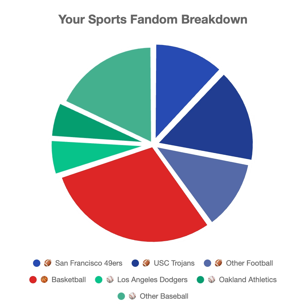
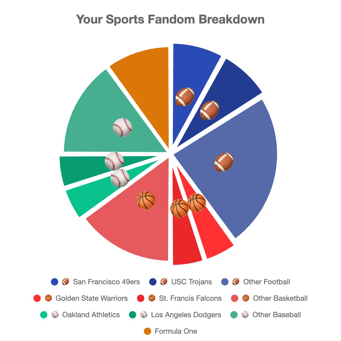
Nested Exploded Pie Charts
Creating the nested breakdown visualization required some Chart.js customization. Each sport gets its own color, and teams within that sport use brightness variations of the same color. Team segments “explode” more than their parent sport segments, creating a nice visual hierarchy. I also added a custom Chart.js plugin to overlay sport emojis on the segments using polar-to-cartesian coordinate conversion.
Analytics (v1.1.1)
I added Vercel Analytics to understand how people are using the app. It’s privacy-friendly and adds minimal overhead with deferred script loading.
Try It Out
Head over to sportspie.site to create your own sports fandom chart. The whole thing is open source on GitHub, so feel free to check out the code or contribute improvements.
Special thanks to @__sportsball for the original idea and Aaron Jorbin for sharing it with our group!
What’s your sports fandom breakdown? Share your chart in the comments!
Leave a Reply