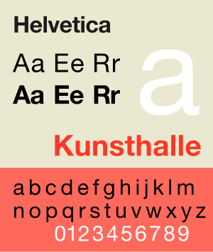
 I like to think that I love good design. Part of that, over the years has evolved into a fair bit of font snobbery. I may have even blogged about fonts before. So, when I saw this comic today, I had to pipe up about a battle Melissa and I have been having. I am totally unabashed in my love of Helvetica. I use it in design, on the blog, and even have watched entire movies dedicated to the typeface.
Melissa, (whom I would also call a font snob) doesn’t like it much because she said, and I quote, “It just looks like the default Excel font.” (Arial) I mentioned that I liked it still, told her that Arial was a ripoff, and Helvetica had been around for a long time. I followed that up with how I couldn’t tell the difference, but great designers use Helvetica, and accountants use Ariel, because they don’t know the difference.
Well, this has caused a bit of a debate, so I want to pose a few tidbits of information about how to tell the difference. BC, everyone needs to know.
From Wikipedia:
Generic versions of Helvetica have been made by various vendors, including Monotype Imaging (CG Triumvirate), ParaType (Pragmatica), Bitstream (Swiss 721).
Monotype‘s Arial, designed in 1982, while different from Helvetica in some few details, has identical character widths, and is indistinguishable by most non-specialists. The capital letters C, G, and R, as well as the lowercase letters a, e, r, and t, are useful for quickly distinguishing Arial and Helvetica. Differences include:
- Helvetica’s strokes are typically cut either horizontally or vertically. This is especially visible in the t, r, and C. Arial employs slanted stroke cuts.
- Helvetica’s G has a well-defined spur; Arial does not.
- The tails of the R glyphs and the a glyphs are different.
Nimbus Sans, another similar font family that incorporates fonts designed in 1940 (Nimbus Sans bold condensed, Nimbus Sans bold condensed (D)) and 1946 (Nimbus Sans Black Condensed, Nimbus Sans Black Condensed (D)), is produced by URW. Nimbus Sans L fonts were released under the GNU General Public License.
“Helv”, later known as “MS Sans Serif“, is a sans-serif typeface that shares many key characteristics to Helvetica, including the horizontally and vertically aligned stroke terminators and more uniformed stroke widths within a glyph.
When you get to know this font, you really start to see it everywhere. Snowbird, the bank down the street, American Airlines, NASA, and many others.
What are some of your favorites?
Helvetica -is- so much classier. I like Kabel … I’m starting to get tired of seeing it thrown around so much though!
@velda – Kabel is cool… My favorite designish font right now is Airstream. It is all over Petomundo…